FLW
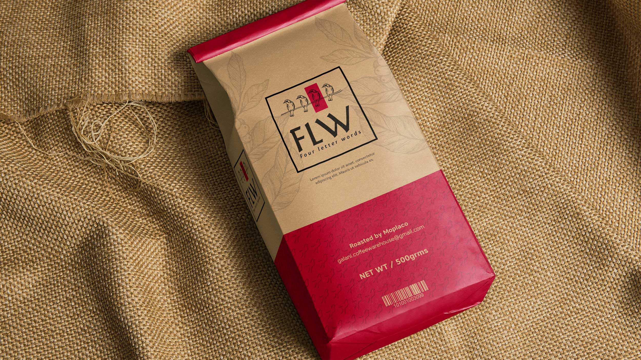
03/31/2020 Client: MOPLACO Addis Ababa, EthiopiaBranding, graphic line for a coffee packaging.
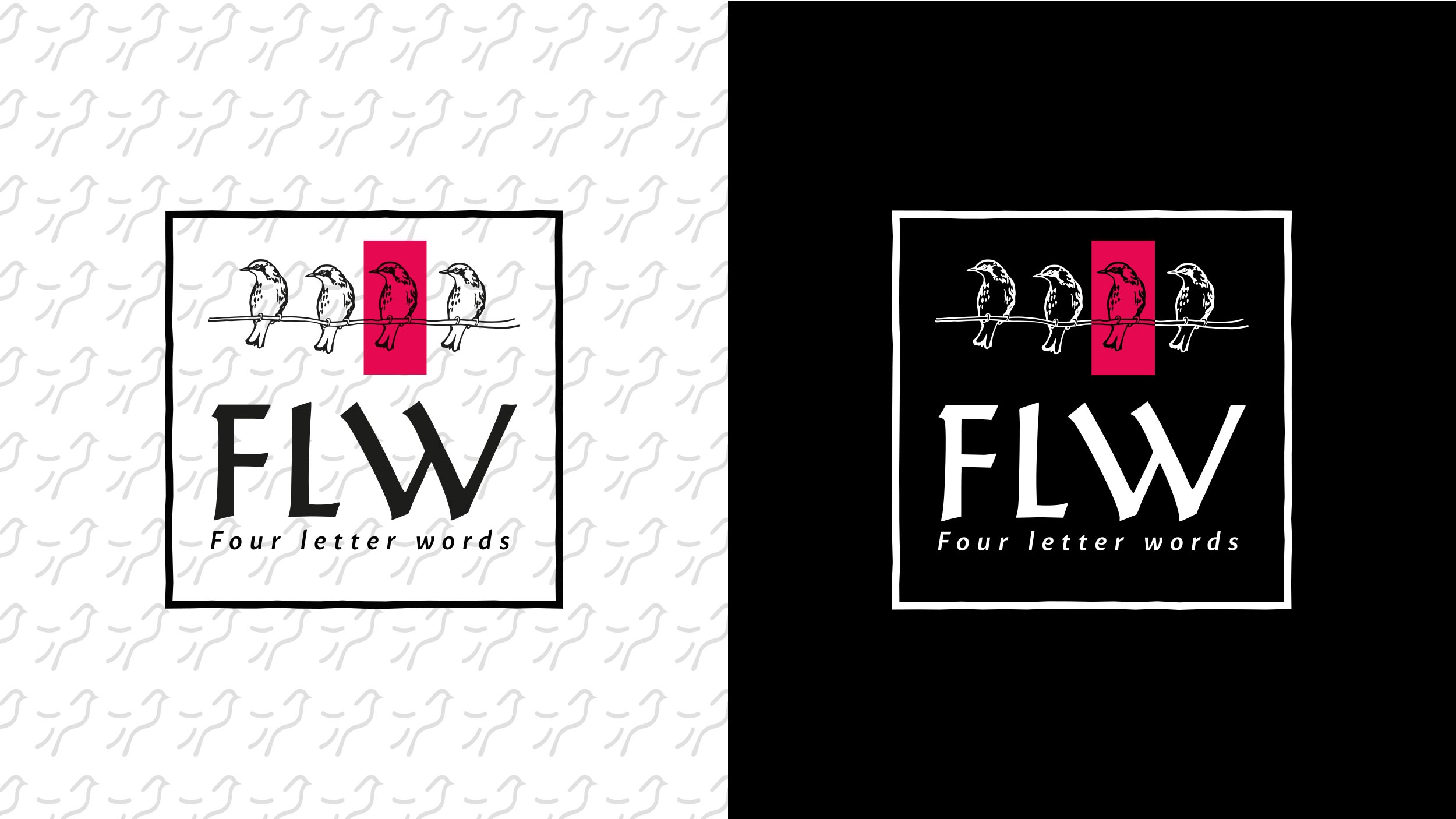
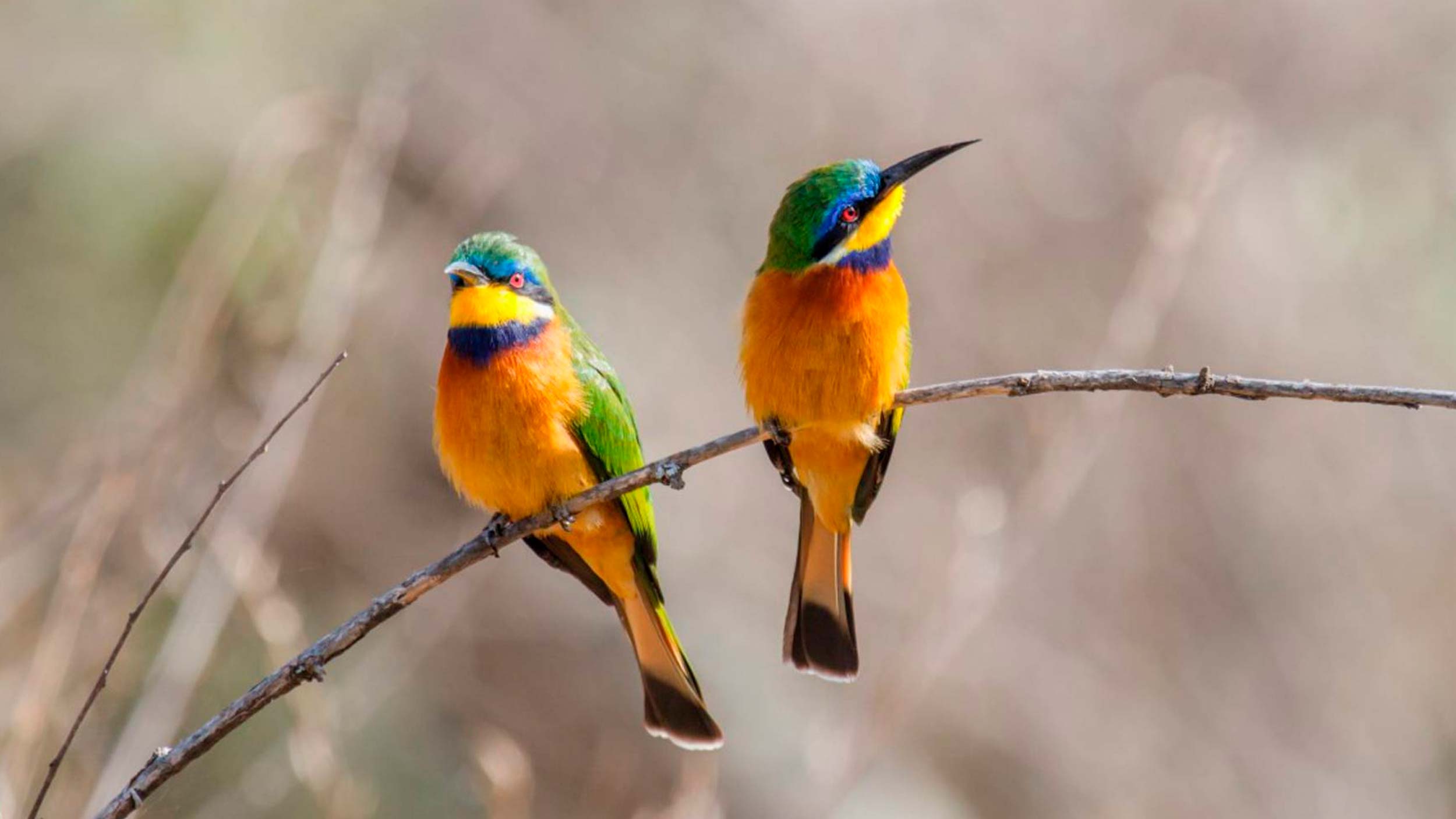
Based on the client's briefing, the objective is to be able to unify elements such as birds belonging to coffee growing areas in Ethiopia where it is more common to see something that for the client would be the most symbolic and important elements that he wishes to see reflected in his brand. The project has an imagotype consisting of 4 silhouettes in a horizontal line of birds where each package would have a different color in one of the silhouettes, this to identify each type of coffee.
The colors used are black, white and for the brand of bird silhouettes the colors ruby, green, orange and yellow.
A display type “Alexander Quill” was selected for the text, matching it with the irregularities of a tree branch opened from flat corners and a sans serif for the slogan “MatoSans MediumItalic”.
COLOR PALLETE
FONTS


