LABORATORIOS MÉNDEZ
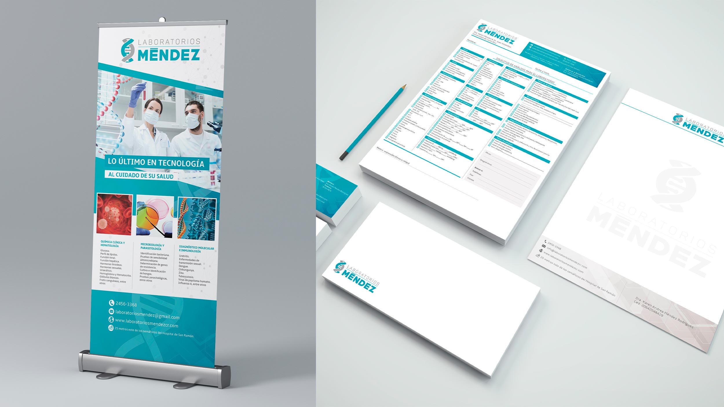
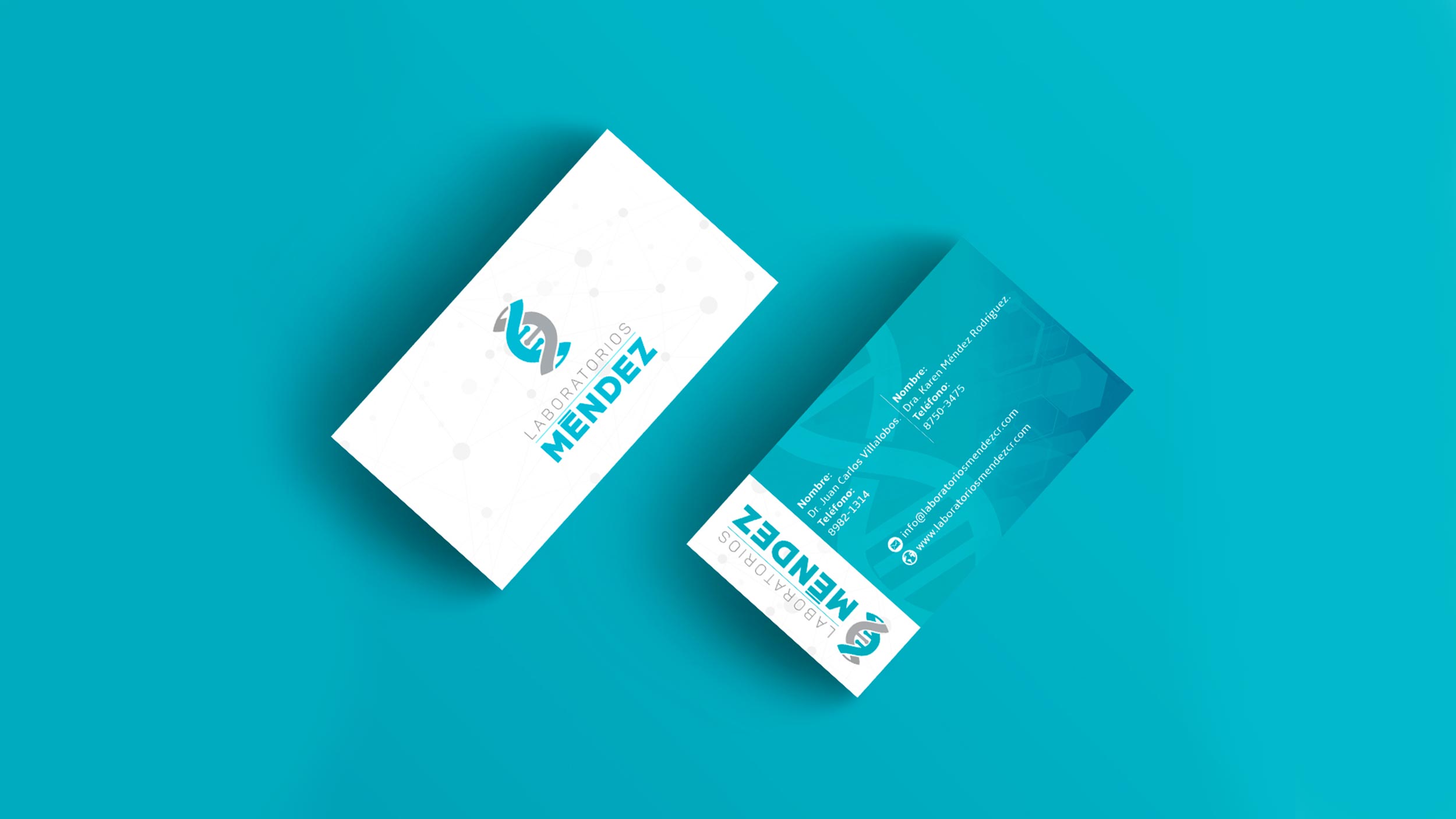
03/31/2020 Client: LABORATORIOS MÉNDEZ Costa RicaBranding, redesign of logo (imagotype) and graphic line for a laboratory.
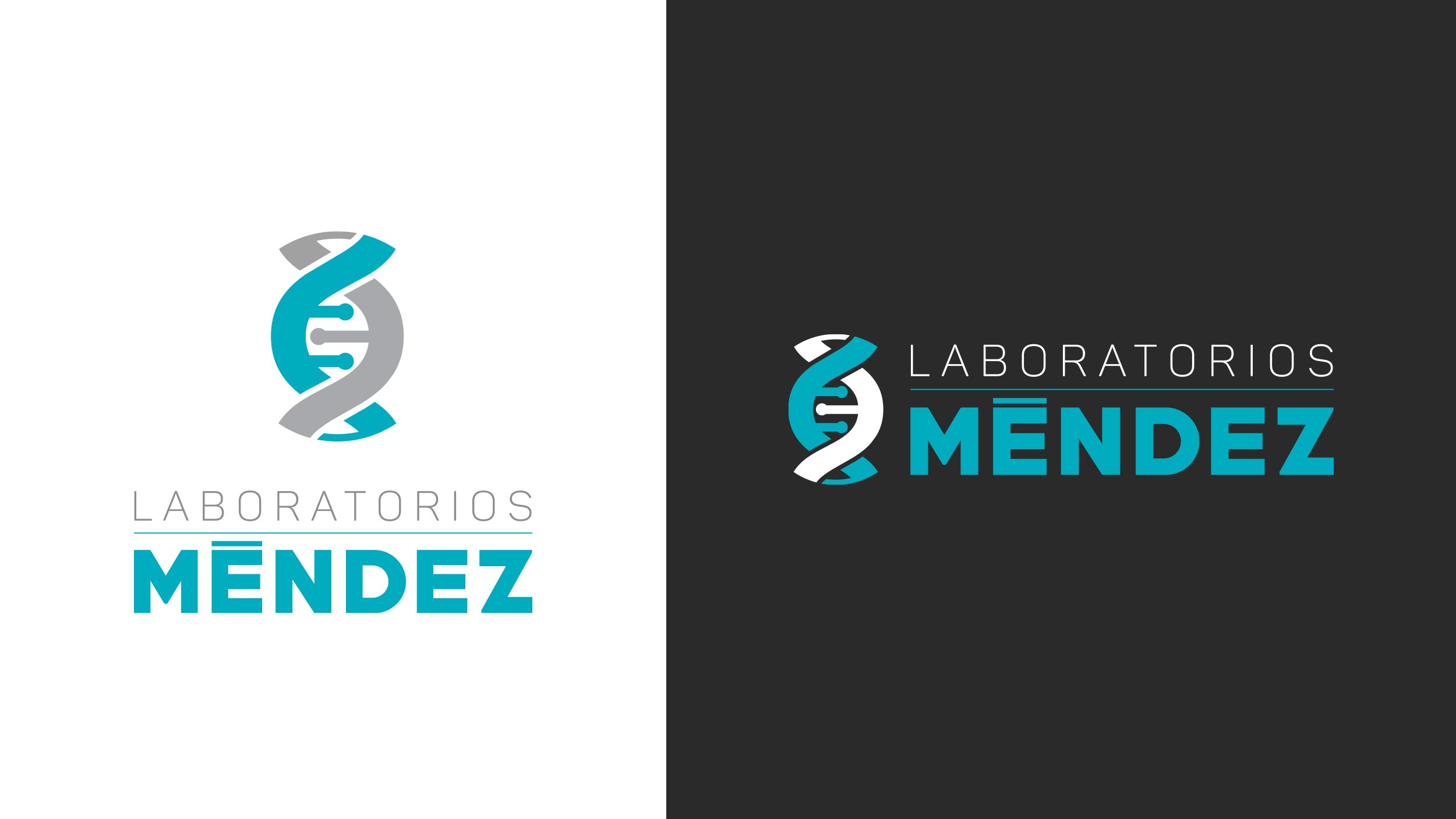
For the logo a symbol was created in the shape of a DNA, at the request of the client they want to publicize their services in a simple way, this was solved by building a DNA symbol that is visually readable and easy to apply about any need knowing that it is from a highly requested sector.
The colors used are an intense turquoise and a light gray selected for the sector and services that the client provides (these provide a connection in the health areas). The topography applied for the logo text are Display "Amble bold" and for the sans serif description "Amble light".
The first in the text is a thick font and was used precisely for the surname since they are always the strongest in brands.
COLOR PALLETE
FONTS

