J-COLOURS
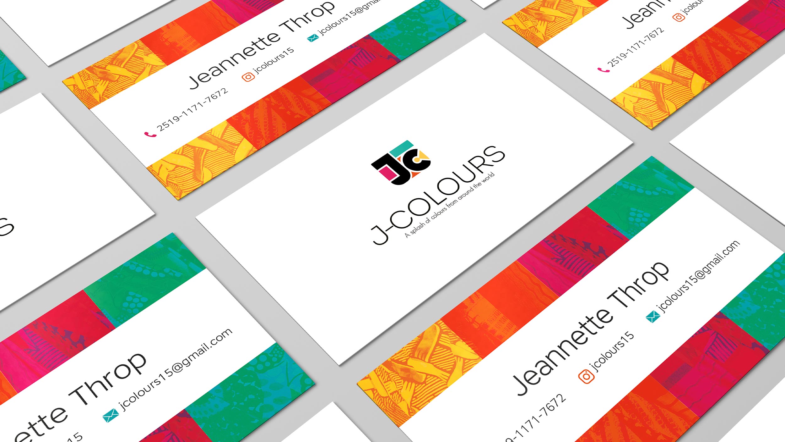
03/31/2020 Client: J-COLOURS EthiopiaBranding, logo redesign (imagotype) for the bag manufacturing business.
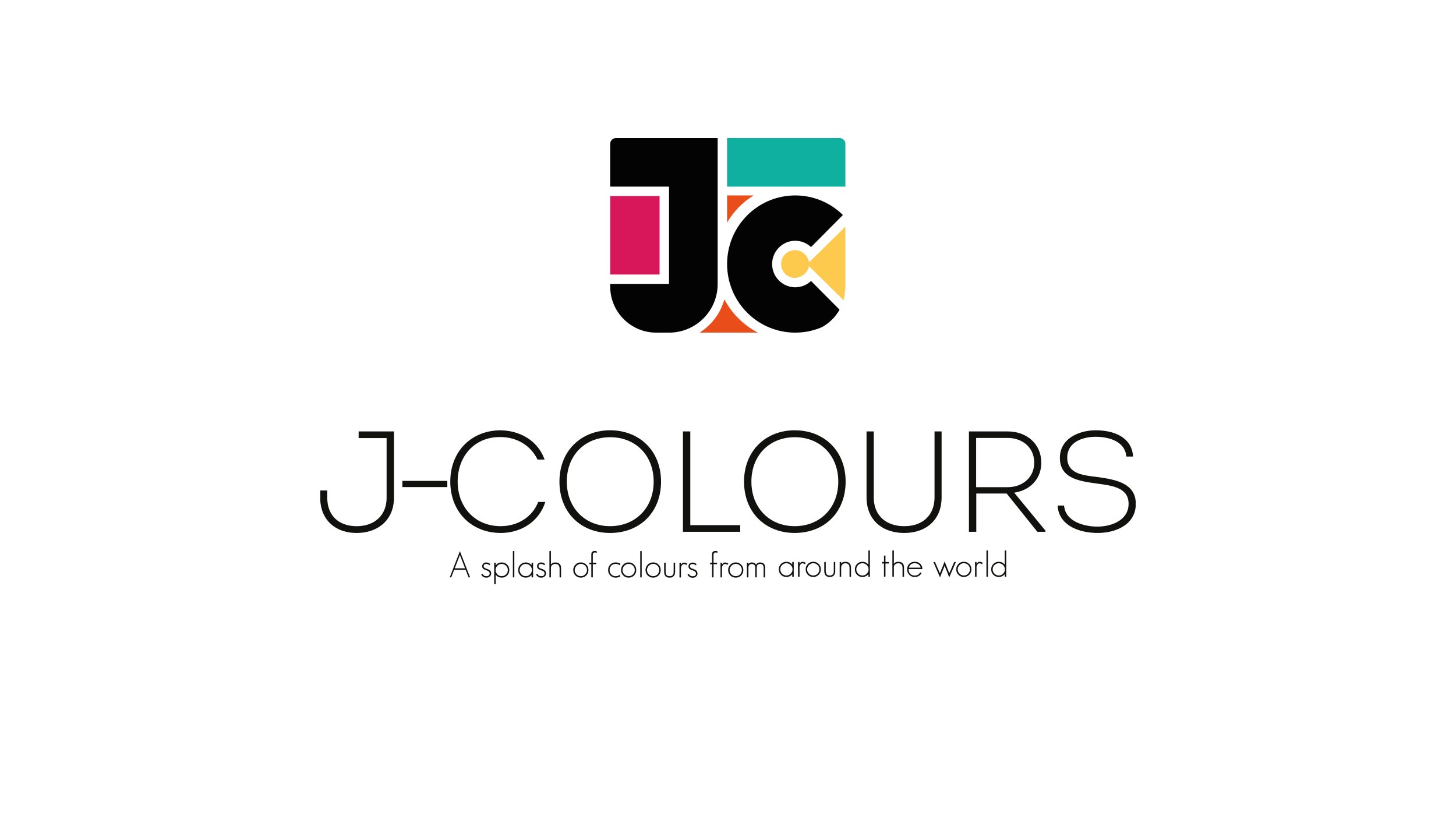
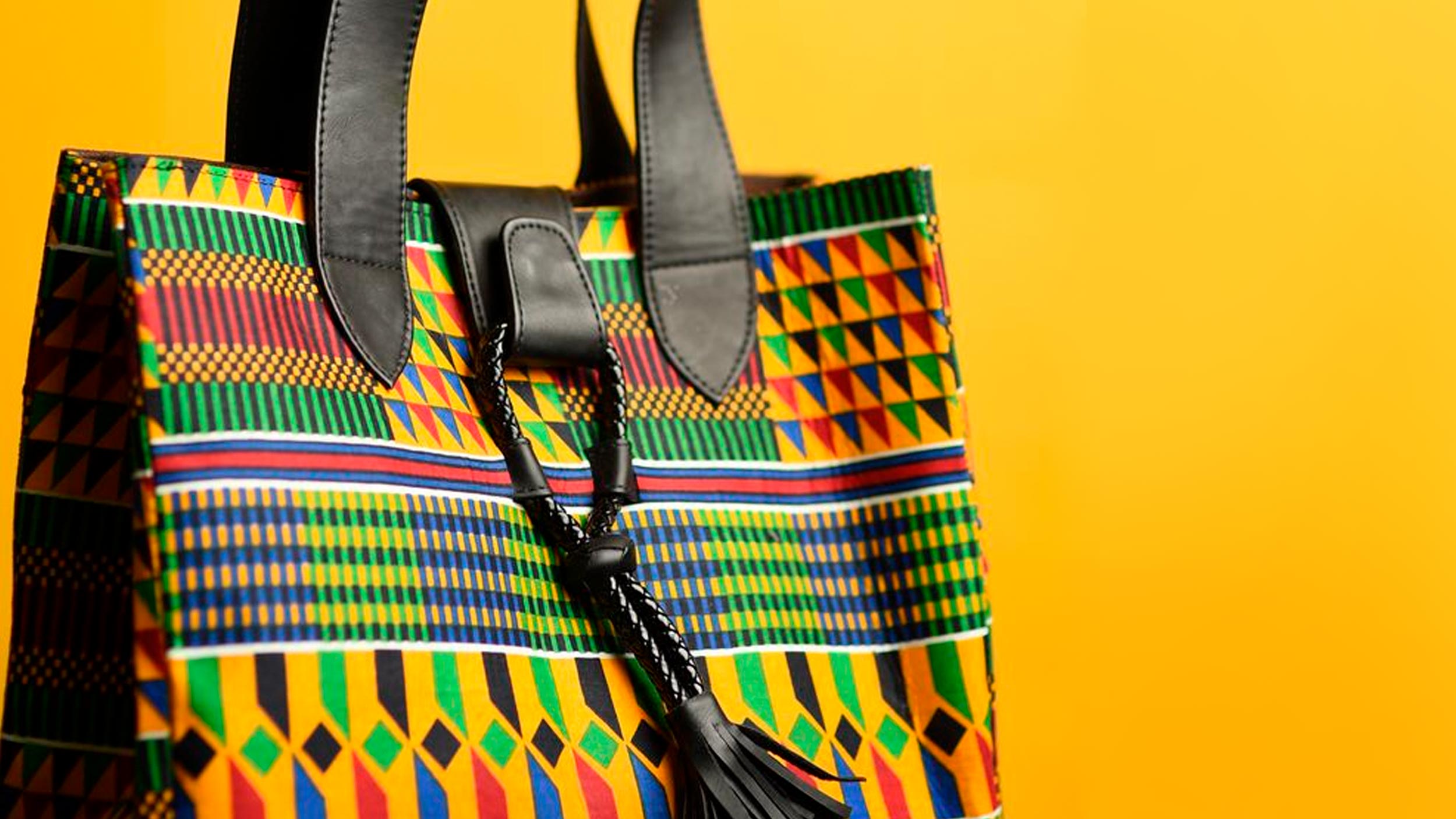
For the creation of the symbol of the imagotype, the initials of the brand "J" and "C" were used, accompanied by color blocks to give shape to a bag, one of the most relevant products of the client.
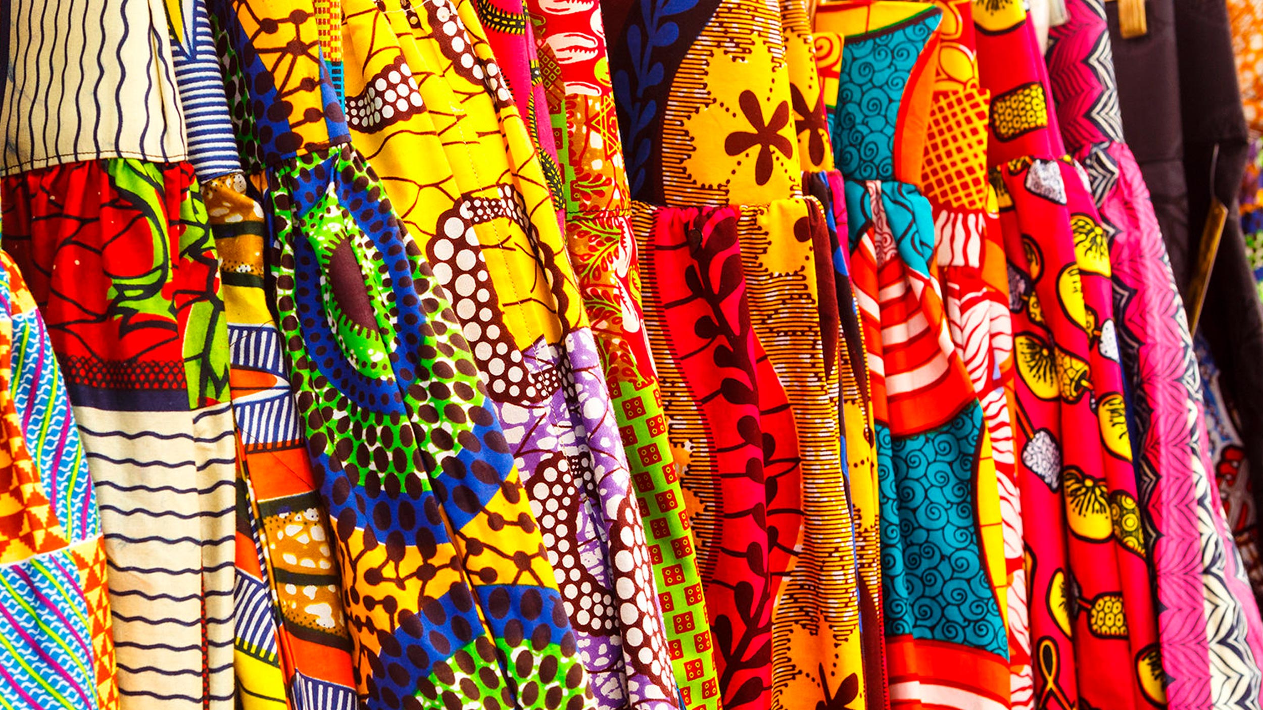
The colors used for this are vivid as a reference to the textures of the materials and finishes of the products. Colors used are turquoise, betanin red, yellow and a scarlet orange.
Applied typography for the logo text and slogan was "Nexa Light", this typeface was chosen to give an elegant and smooth style thought that the brand will be exhibited in many stores and boutiques.
COLOR PALLETE
FONTS

