RISE & SHINE
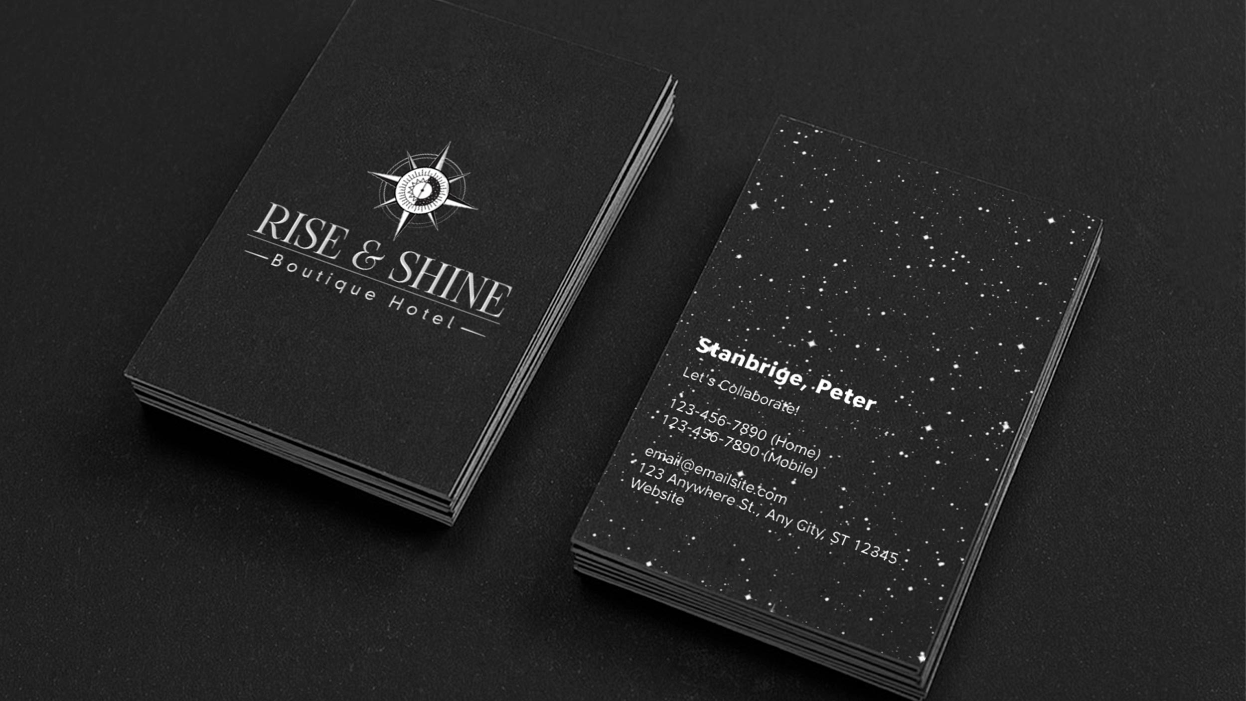
03/31/2020 Client: RISE & SHINE HOTEL EthiopiaBranding, imagotype creation for a boutique hotel.
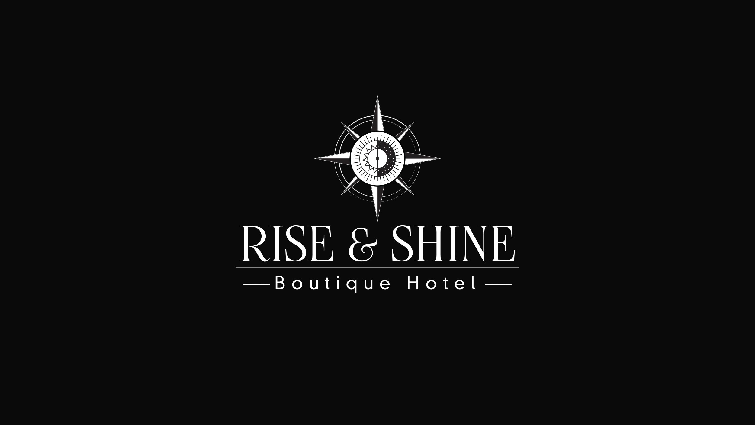
Briefing: Rise & Shine - boutique hotel (translation: get up and shine, you want to imply that it is from morning to night, because you will have a restaurant and bar in the hotel), also the client wants the image to be shaped compass or compass.
For this, a symbol with a simple shape was created, in the center it was created as something alluding to a sun by day and a moon at night, they are united in half, thus achieving the ability to communicate the idea in a clear and simple way.
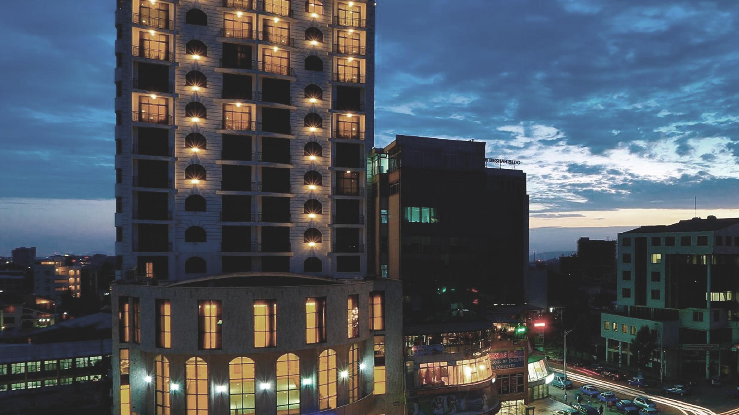
Black and white base colors were used because the project at an architectural level would use those colors and with this we sought to consolidate the brand.
A “FogtwoNo5” serif typeface was used with sans serif style, “DIN Neuzeit Grotesk Light” serif font were used for the description.
COLOR PALLETE
FONTS

