CANOPY HOTEL
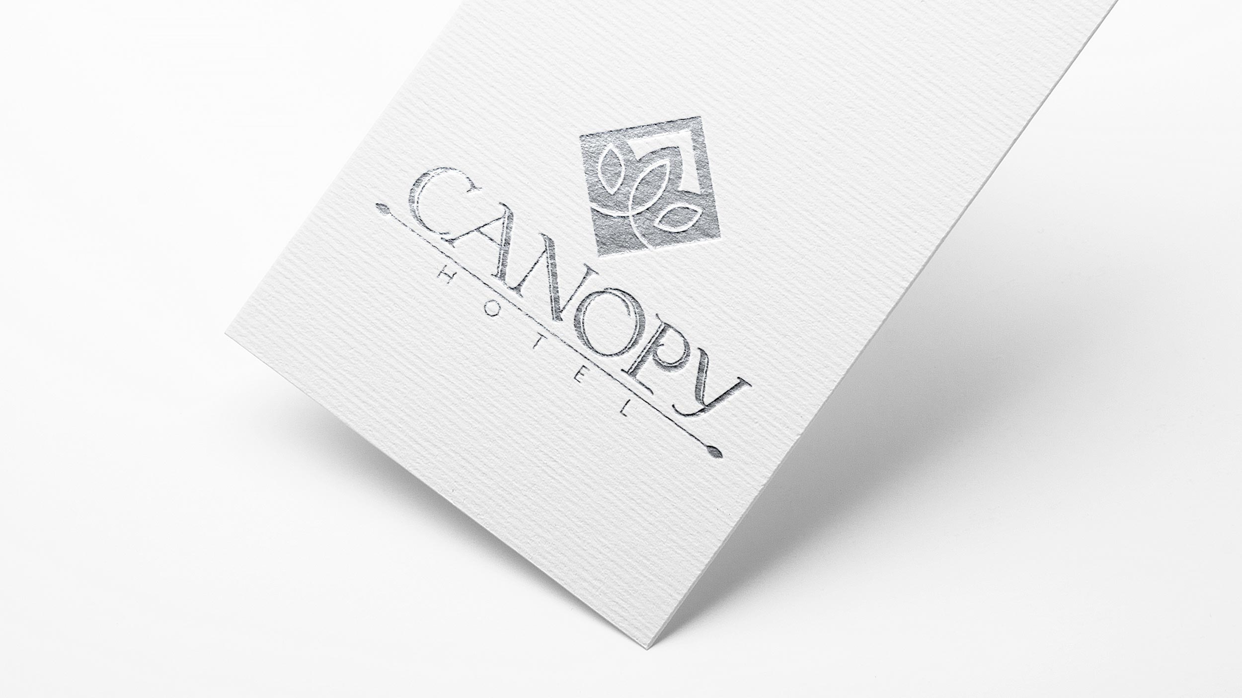
03/31/2020 Client: CANOPY HOTEL EthiopiaBranding, creation of an imagotype for a city hotel with a business focus.
We started with the idea of this project knowing that it would be applied to a hotel with constant traffic and that it is located in a city.
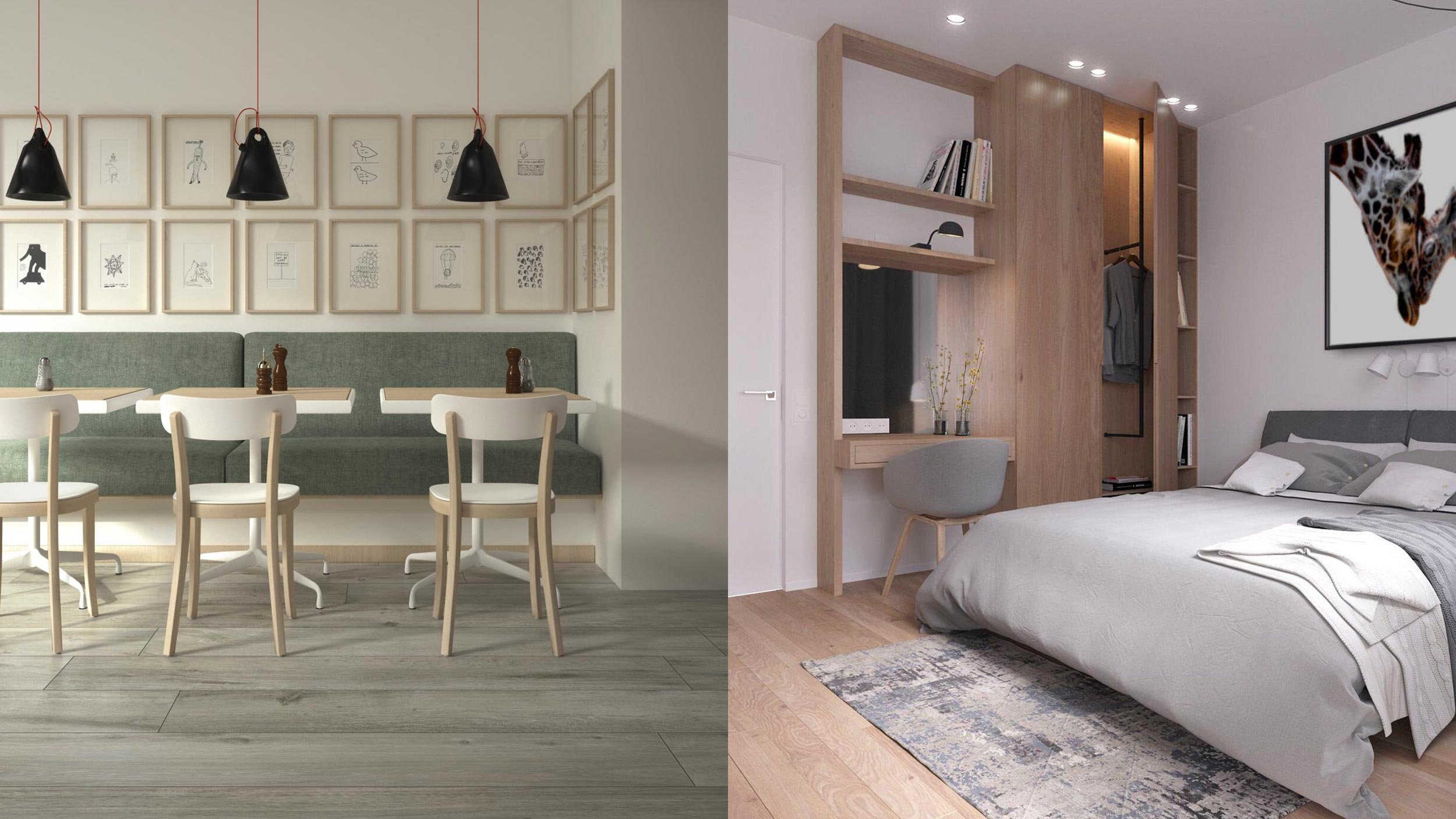
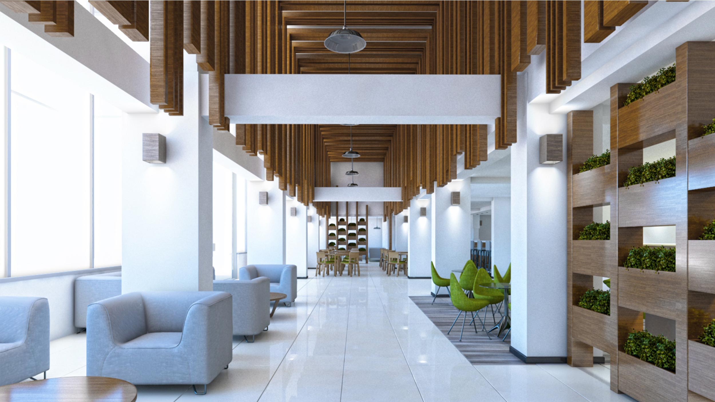
The hotel would have a Scandinavian style and with a natural air of there is its name "CANOPY" which means shade (the shade that creates the top of two trees when they cross).
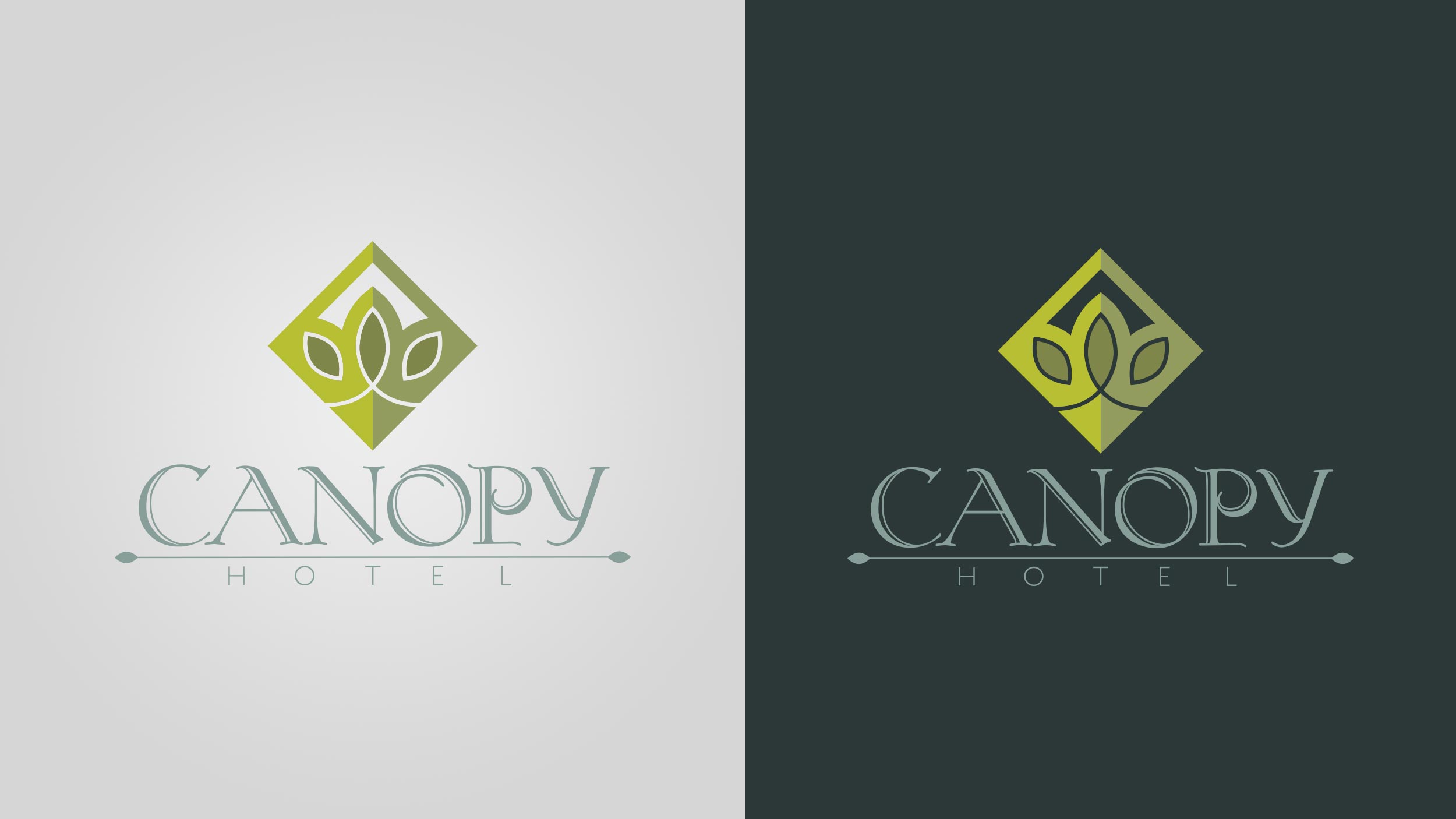
The symbol for the imagotype is made up of three tree oras forming a rhombus combining the smooth with the flat and this at the same time with a divided tone to refer to the shadow.
The aim of the proposal is to take care of simplicity and softness, something that is easy to associate with nature. To achieve that natural air, colors with cold grays and olive green tones were used, elements with details of tree leaves were also used that divide the name with the description and thus achieve more connection with the logo.
A “Koch Rivoli” display typeface was used for the logo with soft shapes and serif style, “Koch Quadrat Fill” for the description.
COLOR PALLETE
FONTS

