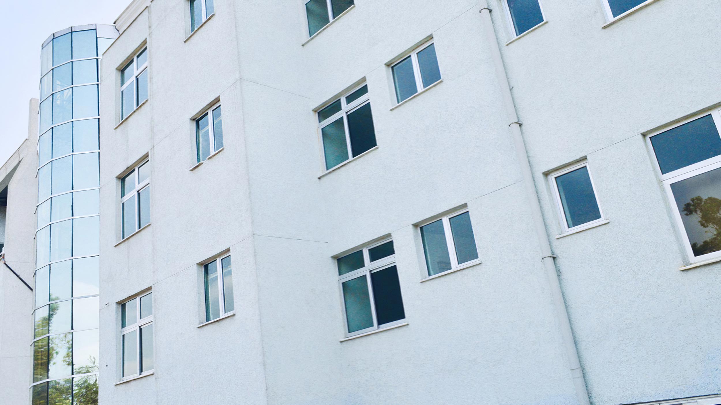
HOSPITAL GENET
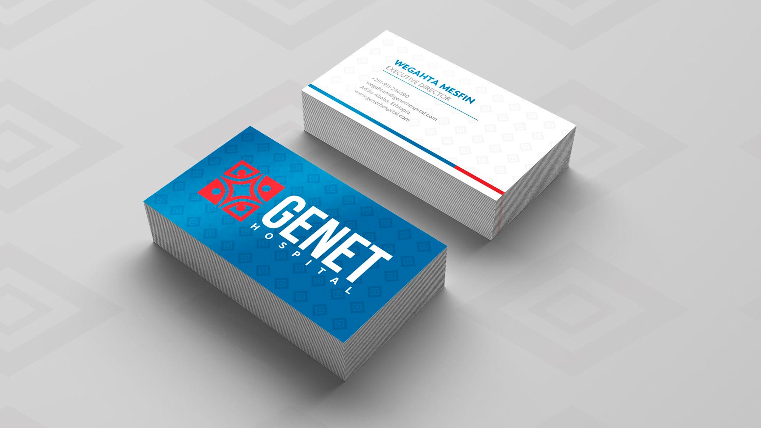
03/31/2020 Client: HOSPITAL GENET EthiopiaBranding, imagotype creation for a hospital.
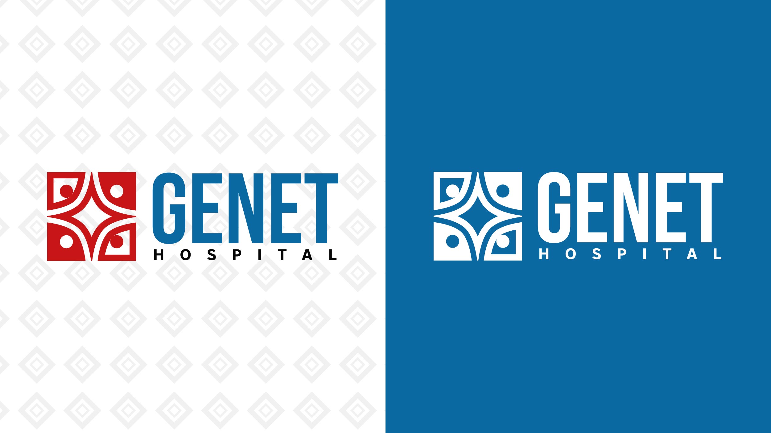
Based on the client's briefing, the main idea is to create a logo (Isologo) made up of a rhombus, stars and a community symbol.
We figured this project out by joining these symbols to form one. A square, a star in the center of four sides with each of those sides curved and in each corner a square with one side curved outwards to represent the community resulting in a simple and clean symbol joining the three symbols that represent to the client the fundamental values of the medical center.
The colors cobalt blue and carmine red were propose by the client, these colors are suitable for the type of service or approach of the entity, in the end the shades have an arrangement so that they are suitable for digital use and for other internal and external applications of buildings.
The fonts Bebas Neue bold and Core Sans were used.
COLOR PALLETE
FONTS

